I discovered that the word of the week @ IllustrationFriday.com was Popularity.
At the same time I was "flickering" and found my inspiration!
ps. this flicker set is...well... pretty awesome! so check it out!
THIS IS HOW i...
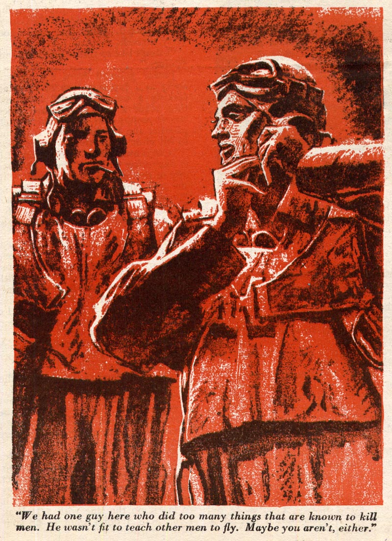
Created a Two colour screen print design that mimics the style of
Grattan Condon's Illustration found in...
Blue Book magazine
Illustrated by Grattan Condon
October 1944
Illustrated by Grattan Condon
October 1944
i chose this illustration to base my design on because...
...I Really like how Condon used, just a splash of white, to build
visual excitement to an otherwise bland colour scheme.
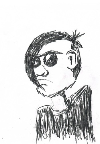
i drew an "emo kid"
i didn't like the look of my drawing. It lacked the messy street art appeal
of my original inspiration!
...so i threw a piece of marker paper over it
and grabbed my black pencil crayon... Then i scribbled!!!
NOTE: i use the term "scribbled" loosely! i don't want to confuse
the viewer. i want to maintain a clear picture/silhouette that contains enough
information; i don't want people to think the guy is an airplane... or a bird... or something....
Now my "emo kid" had the look i was imagining
next: what i did WAS...
i added a microphone into my composition and "re-scribbled" my
design onto another sheet of marker paper. (left)
i used yet another piece of marker paper by laying it on top and
scribbling in what will be my "splash of white" (right)
i wanted the word "popularity" flow/explode out of his mouth; so guess what i did!
I used marker paper!!!
Note: the reason I use marker paper:
1. it's translucent like tracing paper
2. it's thick enough to build up your pencil lead so you can shade and stuff!
3. it's good for a lot of medians
smaller note: it helps if you use a light table
Then...
i brought all these elements and aspects, into photoshop and did a
little tweaking/colour separating... it turned out something like this:
i wanted this "emo kid" to have an audience. i decided that a bunch of
"scribbly people" along the bottom would look good, match the comp.,
and provide a "border" for emo kid to sit on.
...so i
1. drew some people
2. scanned them into photoshop
3. copied and pasted
it ended up looking like this
then...
i made some photoshop magic and...
...voila!
NOTE: i also made the word Popularity wave out of emokid's mouth.
i still felt like my design was lacking...something... it felt empty and emotionless.
after a bunch of "playing around" with ideas...
... ... ...
i fell in love with ThisOne:
i know there's quite a bit of rambling in this blog so i'd like to say...
thanks4reading
if you just looked at the pictures i say...
thanks4lookingat thepictures
Please leave your comments and advice!
Thanks again!
Eric Kools


Fantastic! Love the whole process journey - how you got to your final design which is, by the way, amazing! Have you heard of GoodJoe? If not you should check it out...
ReplyDeleteI agree, the process was fun to look through. The final design is fantastic.
ReplyDeleteThanks for your kind feedback! i actually checked out that GoodJoe site and ended up staying up all night working on a a contest design right away! the theme was "Caulture". Here's the link... http://bit.ly/A4XTK2 check it out!
ReplyDeletecool this is really well layed out!
ReplyDelete