Monday 30 January 2012

TWIRL

I've been aching to create some sort of a "stick man" design for a while now, and 
the word "TWIRL" seemed to speak to that ache.

I've Created a vector one colour screen print. 
Here are the simple-ish steps i took to create my desired look

First i drew up my "road map" paying attention to the spacing of the different elements.


I brought this sketch into Illustrator and drew over it with the pen tool. I found that, the 
solid movement lines, seemed a little too much like, physical objects, rather than 
"figurative expressions of movement" as they were, so I broke them up into dashed lines 
(by, broke them up, i mean i checked off the little box that makes illustrator do it for me)  

Note: I used the circle tool to create the shapes for the hands and the heads (command+c command+v)


I created some visual interest and sense of dimension by tripling up the the dashed lines, 
and creating some solid colour areas in the heads, hands, and top step of the slide.


The Final touch to the design was the was fulfilling each of the character's individual need 
for direction. I did this, in illustrator, by creating a small line with the pen tool. i then checked 
off that "dashed line checkbox", and changed the profile of the stroke from Uniform 
to Width Profile 4. When I was happy with the overall look of my small line segment...
I (command+c command+v)'d 


Here is an idea of what this design would look like on the t-shirt!


Thanks For Reading!
Eric Kools


Tuesday 24 January 2012

International Women's Day, 2012 Poster (Part 2)

 I have been asked to create 
The final artwork will be rendered in acrylic paint.

I sketched out, the USA Coat of Arms (My Interpretation) 
for my final artwork, i need to figure out all the angles, 
sizes, proportions, excreta...


I also traced Judy's face... off my screen... does this void the warranty?


I combined the Two Designs and created One Large Piece of Line Art


Up Next... 

Paint!

Here is a little peek into my colour scheme!


Colour Swatch Provided By:


See International Women's Day, 2012 Poster (Part 1)

Thanks For Reading!

Eric Kools

Sunday 22 January 2012

Prepare

The Word is Prepare! My Goal is to create a Two Colour Screen Print-
able Design. Imagination and concept are up to Me! My theme is Construction.
My inspiration for this piece is…

Publication unknown
Attributed to George Albertus
Year unknown


ThankYou Leif Peng
http://www.flickr.com/photos/leifpeng/sets/72157607303301242/


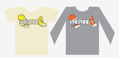
My Idea is to create Simplified Graphic Icons to represent Safety Work Ware
and somehow incorporate the word Prepare. This design may be of some interest
to a contracting company in the future.

My Thumb Nails looked something like this…


The Process Begins!


I found some Reference Pictures via Google Image Search, aranged them
on my computer screen and took a screen shot. I proceeded to print, trace, scan,
and vectorize these "icons" and stylize them to suit my needs.


I then Prepared my text... and arranged my Composition to satisfy the eye...


I Decided to take this One Step Further to show, whom ever is interested, how
this design would look like if i were to prepare it for Screen Printing...


I know i said it was to be a Two Colour Design... But... I decided to, while i was 
colour separating this design , create an aditional layer for this screen print. Now 
my design can be printed with 2 or 3 colours!

And Here You Go
Final Concept!!


Thank You for Your interest!

Eric Kools

...and ThankYou to Illustration Friday for your Inspiration

...although i missed the deadline... :(


Tuesday 17 January 2012

Grounded

I am creating this graphic with the intention to apply it to a T-shirt.
Designed to illustrate the word Grounded, using a piece of illustration
artwork from the past as inspiration, striving towards creating an
interesting, fun, and intelligent, Four Colour Screen Printable product;
I created this Vector Artwork with great enthusiasm and am planning to
try this style again in the near future.


Here is my Inspiration Art Piece
Woman's Day magazine
Illustrated by Robert Jones
February 1961

I like how Robert Jones used the "colour white" to illustrate 
the subject madder, and reinforce the idea of importance.  
The Monochromatic Simplicity in this illustration is what 
really caught my eye.

Here are my thumbnails and illustration development scans

This is my Final Product.


I'm always open to improving my design, so if anyone has any 
productive suggestions please feel free to comments.

Thanks for reading!

Sincerely: 
Eric Kools

Monday 16 January 2012

International Women's Day, 2012 Poster

In this Project; I have been asked to create 
The final artwork will be rendered in acrylic paint. 

I have chosen Judge Judith Sheindlin as 
my Woman Of Inspiration


My inspiration for this project is Al Parker's composition in...
Cosmopolitan magazine
Illustrated by Al ParkerSeptember 1954


My Plan is to have "Judge Judy" in the foreground, sitting 
up high behind "The Bench" in bright, high contrast colours, 
and a lot of fine detail. And the American Coat of arms 
will be in the background, in dark low contrast colours, and 
thick strokes.

I was also given the idea to include the words "International 
Women's Day, 2012" in scroll like banners on one side of the 
poster and "Judge Judith Sheindlin" on the other side 
in another "scroll"

Here are some Thumbnails to give you a better idea of 
what i'm planning


So there is where i am and i'll be posting progress as i go

thanks for your interest
cheers!

Eric Kools