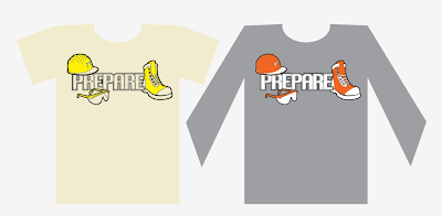
able Design. Imagination and concept are up to Me! My theme is Construction.
My inspiration for this piece is…
Publication unknown
Attributed to George Albertus
Year unknown
http://www.flickr.com/photos/leifpeng/sets/72157607303301242/
My Idea is to create Simplified Graphic Icons to represent Safety Work Ware
and somehow incorporate the word Prepare. This design may be of some interest
to a contracting company in the future.
My Thumb Nails looked something like this…
The Process Begins!
I found some Reference Pictures via Google Image Search, aranged them
on my computer screen and took a screen shot. I proceeded to print, trace, scan,
and vectorize these "icons" and stylize them to suit my needs.
I Decided to take this One Step Further to show, whom ever is interested, how
this design would look like if i were to prepare it for Screen Printing...
I know i said it was to be a Two Colour Design... But... I decided to, while i was
colour separating this design , create an aditional layer for this screen print. Now
my design can be printed with 2 or 3 colours!
And Here You Go
Final Concept!!
Thank You for Your interest!
Eric Kools
...and ThankYou to Illustration Friday for your Inspiration
...although i missed the deadline... :(


That is... great. Really great. I'm really impressed. Nice work! Excellent step-by-step demo and a very appealing, solid final design. :^)
ReplyDelete